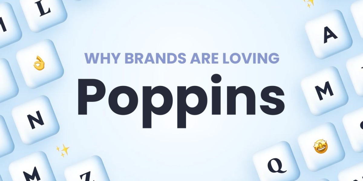
Introduction to Poppins Typeface
In the vast world of typography, where each font carries its own unique essence, Poppins Typeface emerges as a versatile and elegant choice. Developed by the Indian Type Foundry, Poppins is a sans-serif typeface that effortlessly blends modernity with tradition, making it suitable for a wide range of design applications.
Origins and Development
Poppins Typeface was first released in 2014 by the Indian Type Foundry, a renowned independent type foundry based in Ahmedabad, India. The font was designed by Indian type designer Ninad Kale, aiming to create a contemporary typeface with a hint of the rich cultural heritage of India.
Characteristics and Style
Poppins Typeface boasts a clean and minimalist design, characterized by its rounded corners and balanced proportions. The font exudes a sense of friendliness and approachability, making it a popular choice for both digital and print media. Its versatility shines through in various weights and styles, offering flexibility in design compositions.
Application and Versatility
One of the notable features of Poppins Typeface is its adaptability to different design contexts. Whether used for headlines, body text, or branding elements, Poppins maintains legibility and clarity across various sizes and resolutions. Its extensive character set supports multiple languages, catering to global audiences.
Design Trends and Popularity
In recent years, Poppins Typeface has gained significant traction among designers and creatives worldwide. Its clean aesthetics and readability make it a preferred option for websites, mobile apps, advertising materials, and branding projects. The font's popularity is further fueled by the growing demand for modern, minimalist design styles.
Poppins Typeface in Digital Design
With the proliferation of digital platforms, the importance of choosing the right typeface has become paramount. Poppins Typeface addresses this need by offering excellent readability on screens of all sizes. Its web font versions ensure consistent rendering across different browsers and devices, enhancing the user experience.
Conclusion
In the realm of typography, Poppins Typeface stands out as a versatile and visually appealing choice. Its clean aesthetics, extensive character set, and adaptability make it a valuable asset for designers seeking to elevate their projects. Whether used for web design, print media, or branding, Poppins adds a touch of elegance and sophistication to any composition.
For designers and typographers looking to infuse their creations with a modern yet timeless appeal, Poppins Typeface remains a steadfast companion, ready to enhance visual communication in diverse settings.
Visit MaisFontes today to explore the beauty and functionality of Poppins Typeface for your next design endeavor.